A fitness app for finding personal trainers and tracking fitness goals.
The platform connects fitness enthusiasts with certified personal trainers, convenient training locations, group and individual classes, and sporting events - all in one place.
Client
Leapy
Location
Australia, Kazakhstan
Timelines
Apr 2021 - Oct 2021
Project overview
Mobile app
UX Research
User Testing
Design Thinking
Experience Redesign
Design System Developement
Visual Design
The challenge
The business worked. The digital experience didn’t.
The existing experience made it difficult for users to navigate the app and find the right trainers, workouts, and activities. Key user flows lacked clarity, creating friction throughout the journey.
Meanwhile, the business model, day-to-day operations, and team were functioning well offline, with an established network of trainers and services. The challenge was translating that well-functioning business into a coherent digital experience.

Business goals
What mattered from the start
The project started with a focus on UX - restructuring user flows and information architecture - and eventually expanded into UI design as well. Both were needed to support the bigger picture: retaining existing users, bringing them back, attracting new ones, and improving the overall quality of the product.

Getting into the field
Understanding who we’re designing for
To better understand the B2C audience, I conducted qualitative research through 12 in-depth user interviews, with each session lasting approximately 45–60 minutes. The research was conducted over 2 weeks, covering users with different fitness goals, training habits, and levels of experience.
The interviews focused on understanding customers’ needs, pain points, expectations, motivations, and how they currently discover and choose trainers, workouts, and training locations. The findings helped uncover patterns in user behaviour and provided a foundation for rethinking the product’s user flows and information architecture.
Research methods
1:1 user interviews
Focus group interviews


Putting it in their hands
Testing the existing experience
To understand how the existing product performed in real-world scenarios, I tested the main user flows with users representing both key personas — clients and trainers — across different devices.
The testing revealed 35 usability issues, ranging from unclear interactions and insufficient feedback to missing functionality across key journeys.

What the testing revealed
Users could not create a request for a workout
The system provided insufficient feedback after key actions
Users could not access the map or get directions directly from a training
Trainers lacked essential information about their training sessions
Trainers could not view training history or duplicate previous sessions
There was no way to save an unfinished workout as a draft
Users had no way to search for specific trainers
Looking at the market
Secondary research
Before defining how Cladda should work, I wanted to understand how people currently connect, what gets in the way of meaningful relationships, and where existing platforms fall short. I combined market and competitor research with conversations with potential users to uncover patterns, unmet needs, and opportunities for a different kind of social experience.
Research methods
SWOT Analysis
Competitor mapping
UX Benchmarking
Market analysis
Feature benchmarking

What was making the app harder to use?
01
We need to know where to go and what to do
When the structure of the app isn't clear, finding a trainer, workout, class, or training location becomes unnecessarily difficult.
Solution
Restructure the navigation and core user journeys around the way users naturally look for and choose training options.
02
We need to know what's happening
When the app doesn't clearly respond to our actions or show our current status, it's difficult to understand whether something worked or what to do next.
Solution
Introduce clearer system feedback, status visibility, and guidance throughout key journeys.
03
We need the right tools to complete our goals
Missing or hard-to-find features can turn simple tasks into frustrating workarounds - from finding a trainer to creating or managing a workout.
Solution
Identify and prioritize missing functionality through user testing, then integrate it into clearer, more purposeful journeys.
04
Trainers need a different experience from customers
Trainers have their own workflows, information needs, and responsibilities, but the existing product didn't always account for them.
Solution
Restructure the experience around both personas, giving customers and trainers the information and tools they need while keeping the overall product cohesive.
05
We shouldn't have to figure out how every button works
Inconsistent interactions and visual patterns made the interface less predictable and increased the effort needed to use the app.
Solution
Establish a consistent UI language and reusable design patterns to make interactions more intuitive and predictable.
What are users really looking for?
I used the Jobs To Be Done (JTBD) framework to understand the different situations in which users turn to the app, what they’re trying to accomplish, and what they expect to achieve.

Situation
Motivation
Outcome
User Flows
Once the high-level journey was mapped, I broke it down into individual tasks and actions users needed to complete. I then mapped these into detailed flows, identifying key touchpoints, decision points, and alternative paths along the way.

Component-based Design System
The existing Design System provided by the client was incomplete and lacked components needed for the redesigned experience. I created a new adaptive component library and expanded it with components for the updated features. This improved consistency across the product and increased the team’s design and development productivity by 60%.

UI Design
After creating the initial mockups, I collaborated closely with the development team to ensure the designs were both visually refined and technically feasible. We iterated on the screens where needed before finalizing the designs for implementation.

Book a training session
01
This feature lets users find and schedule sessions with certified personal trainers based on their preferred training type, location, and availability. Users can browse available trainers and time slots for group or individual sessions. If they can't find a suitable option, they can submit a custom training request, specifying their preferences and availability. The request is then shared with relevant trainers, who can respond with their availability and session details.

Trainer’s Profile
02
The trainer profile gives users everything they need to evaluate a personal trainer before booking a session. It highlights their experience, certifications, specializations, training approach, availability, and reviews, helping users find a trainer who matches their goals and preferences.

Fitness social feed & workout buddies
03
The social feed creates a sense of community by giving users a space to share their fitness experiences, motivate each other, and discover new opportunities. Users can also find like-minded workout buddies nearby based on their location and preferred sports, browse profiles, and connect with potential training partners through messaging.


Chat & Support
04
The chat feature allows users to connect, create groups around shared activities, organize sports events, and exchange information about their interests. An integrated support chat also gives users a direct way to reach the support team, helping resolve questions or issues quickly and keeping the overall experience seamless.

Rewards program
05
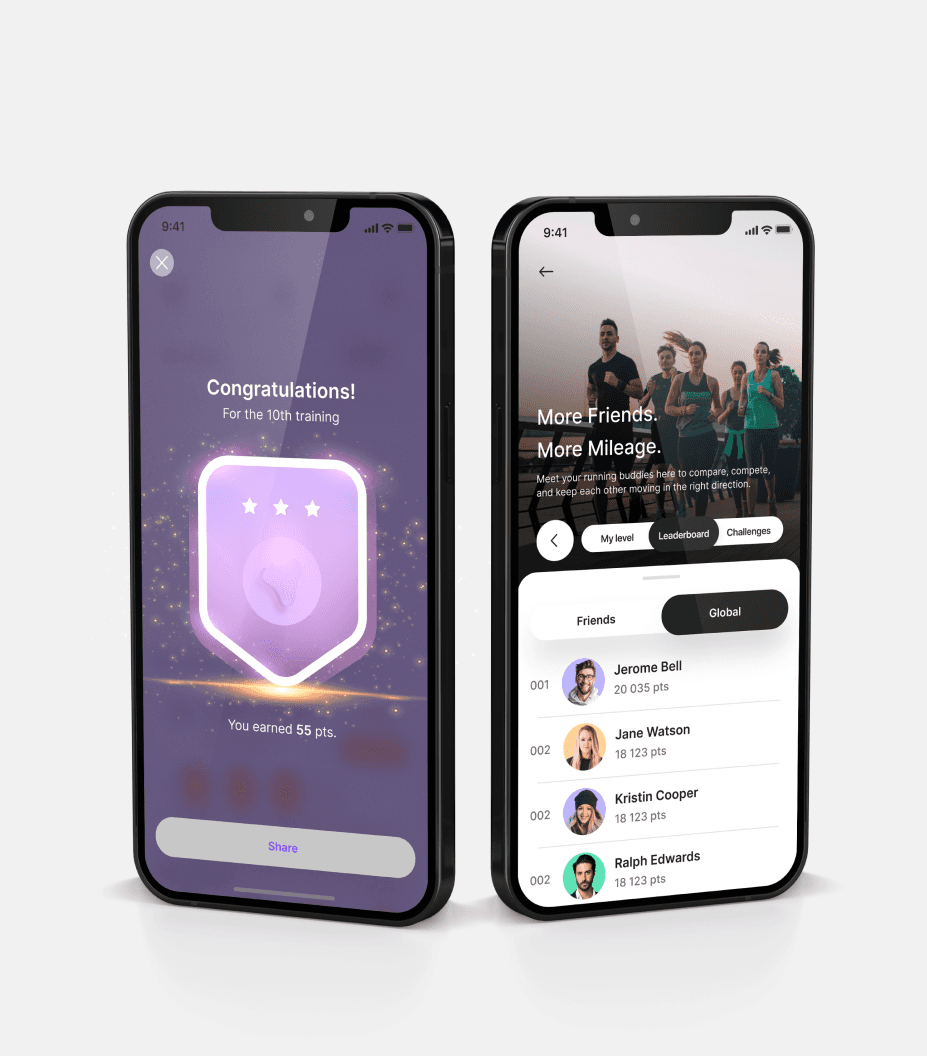
The rewards program encourages users to stay active by earning coins for completing workouts, challenges, and marathons. Coins can be exchanged for sports goods in the app’s catalog, while activity levels and progress give users a clear sense of achievement and motivation to keep moving.

From a confusing app to a clearer experience
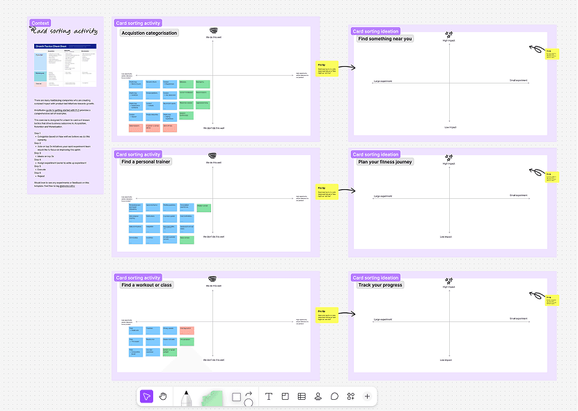
What started as a UX-focused project to understand and restructure the product evolved into a broader redesign of the entire digital experience. Through user research, testing, card sorting, and iterative design, we rethought the information architecture, user journeys, and eventually the visual language of the app. The result was a more intuitive and cohesive experience for both students and trainers, making it easier to discover, book, manage, and engage with fitness activities.

Trusted by many